Bionic Insurance E2E
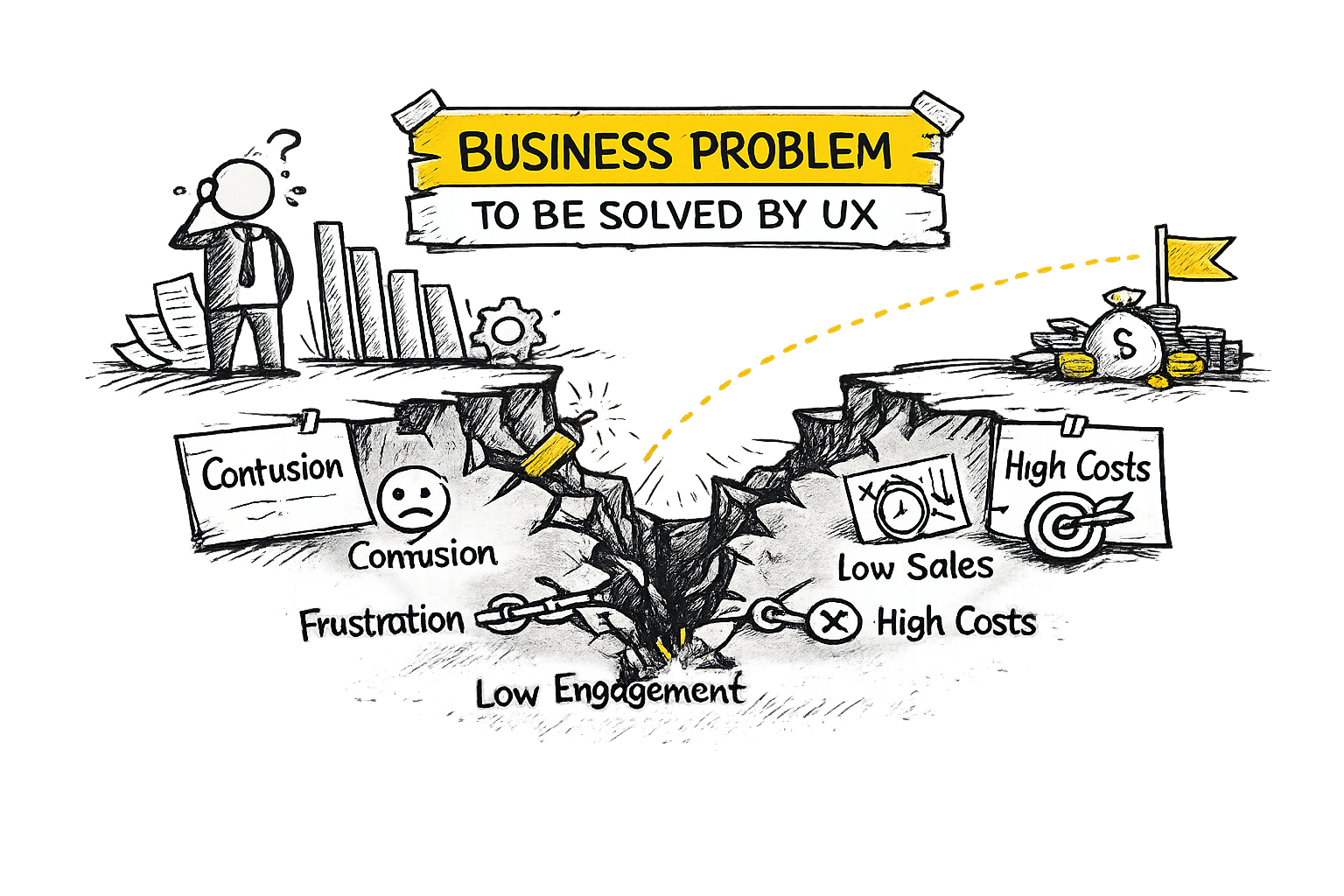
The Problem
Bionic relied on a third-party insurance journey that we did not control. This limited our ability to collect analytics, run experiments, or optimise the customer experience.
I was tasked with designing a fully Bionic-owned end-to-end property insurance journey, enabling:
- Full analytics and behavioural tracking
- Experimentation and A/B testing
- Continuous UX optimisation
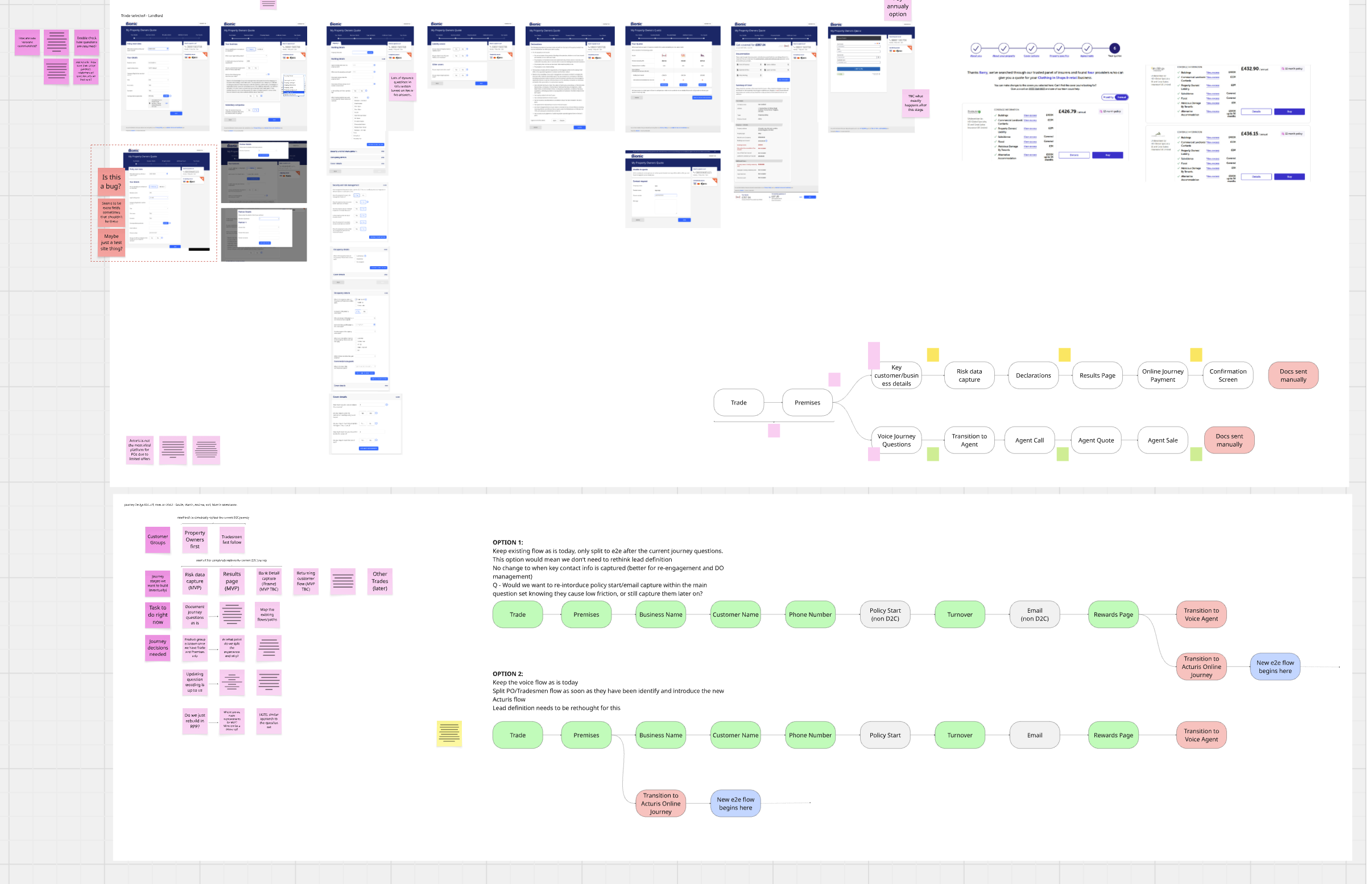
A major constraint was that the journey still needed to use risk questions defined by Acturis, the insurance platform powering the underwriting process.
Because the Acturis API was not initially available, I had to reverse engineer the question set from an internal agent tool. These questions were written for brokers rather than customers, so the challenge was to translate complex insurance language into clear customer-facing questions while preserving the legal meaning required for insurers’ statement of facts.
This required close collaboration with internal insurance specialists to ensure wording changes remained compliant and acceptable to the insurer panel.
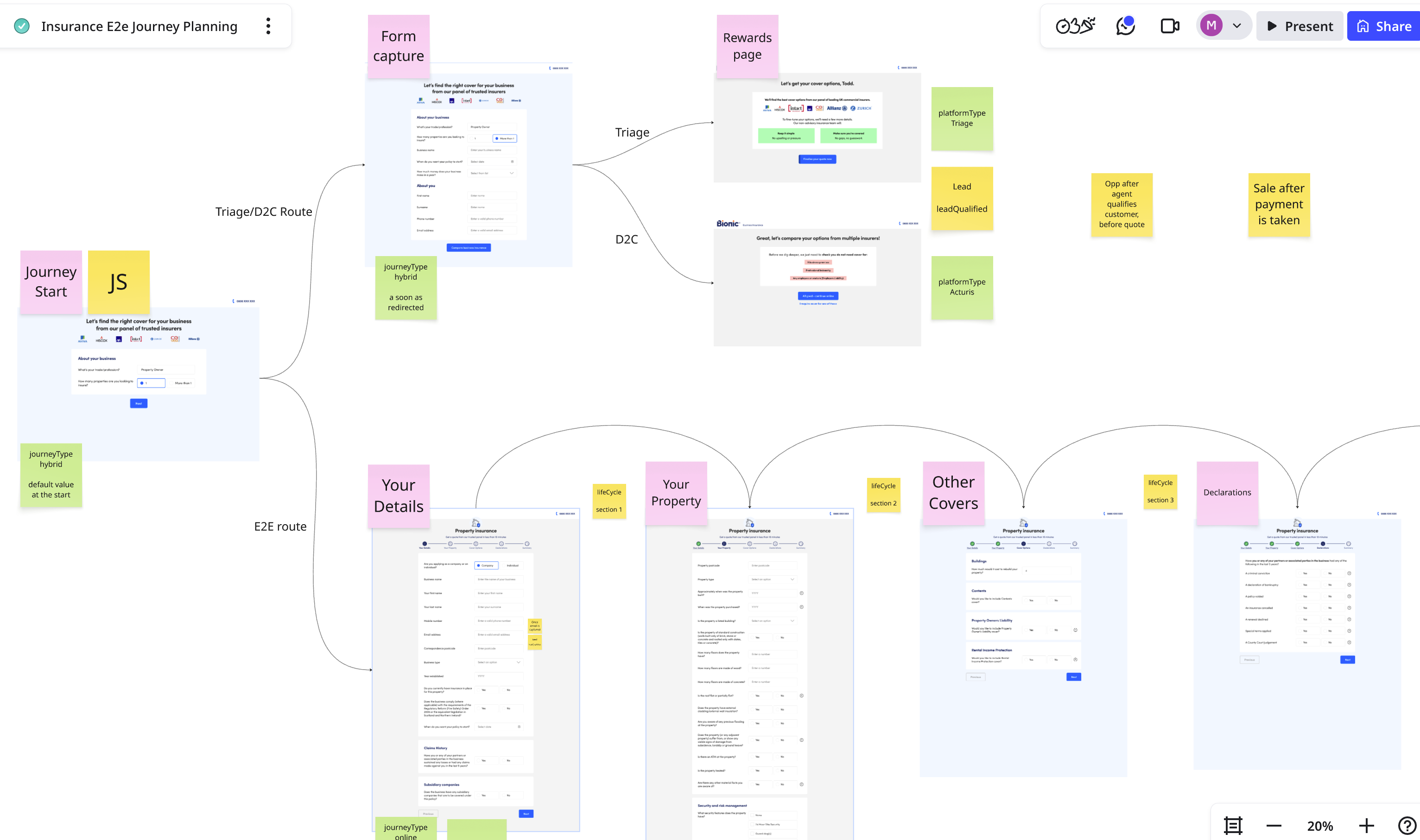
Information Architecture & Question Design
Insurance journeys often contain extensive branching logic, where answers trigger additional questions. I mapped the full question set and structured it into a clear information architecture.
Key activities included:
- Extracting and categorising the complete risk question set
- Designing the navigation structure for the journey
- Mapping branching logic and dependencies between questions
- Identifying opportunities to simplify or reframe complex wording
To inform design decisions, I conducted a competitor analysis of 10 business insurance providers, identifying:
- Common usability issues
- Patterns used to structure long insurance journeys
- Opportunities to reduce cognitive load
This work helped shape the final flow and ensure the journey aligned with industry expectations while improving clarity.
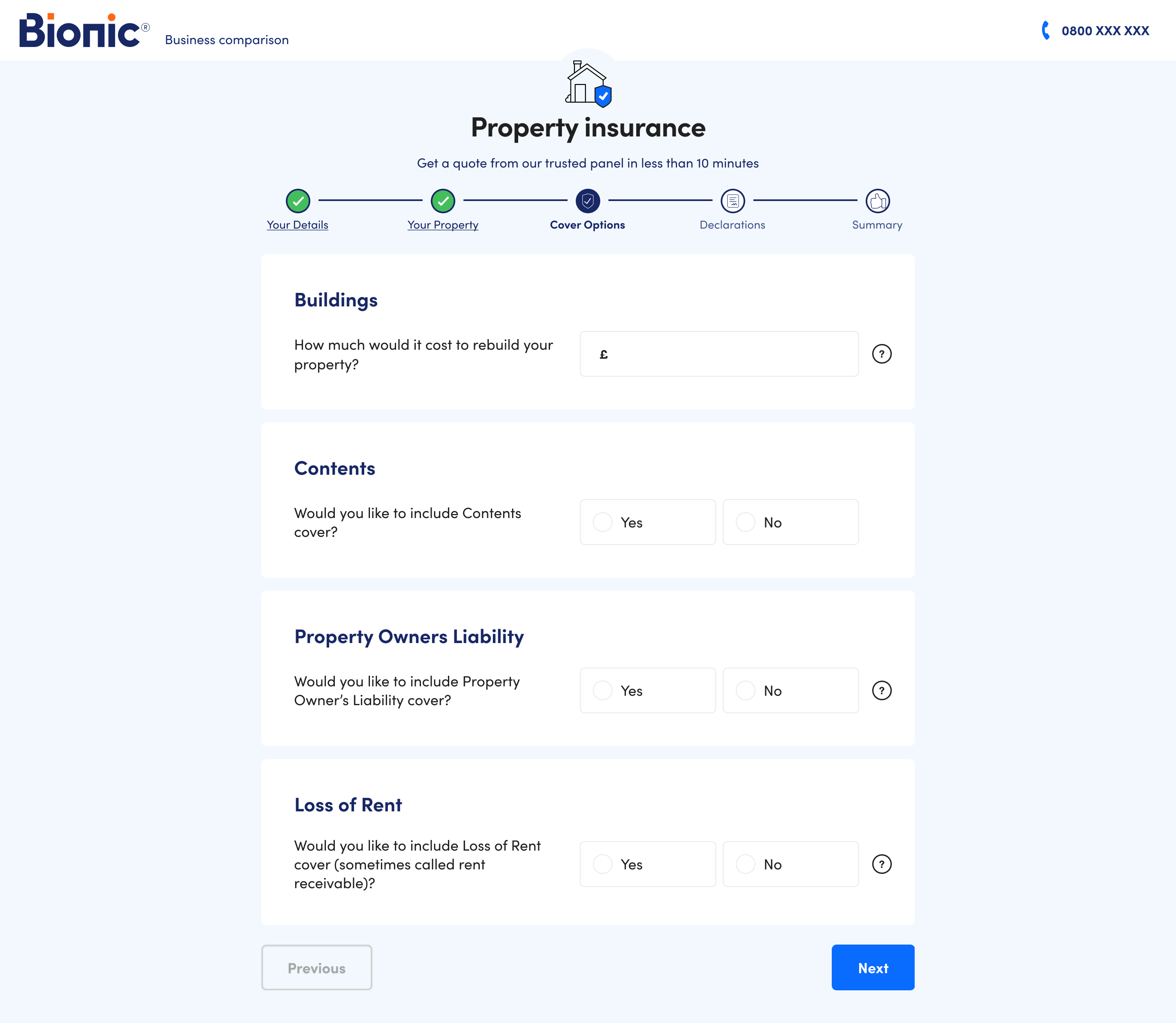
UI Component Design
Because the journey required a high volume of structured inputs, I developed a new form-optimised component system in Figma.
Components included:
- Radio selections
- Checklists
- Dropdowns
- Tabs
- Address lookup
- Text inputs
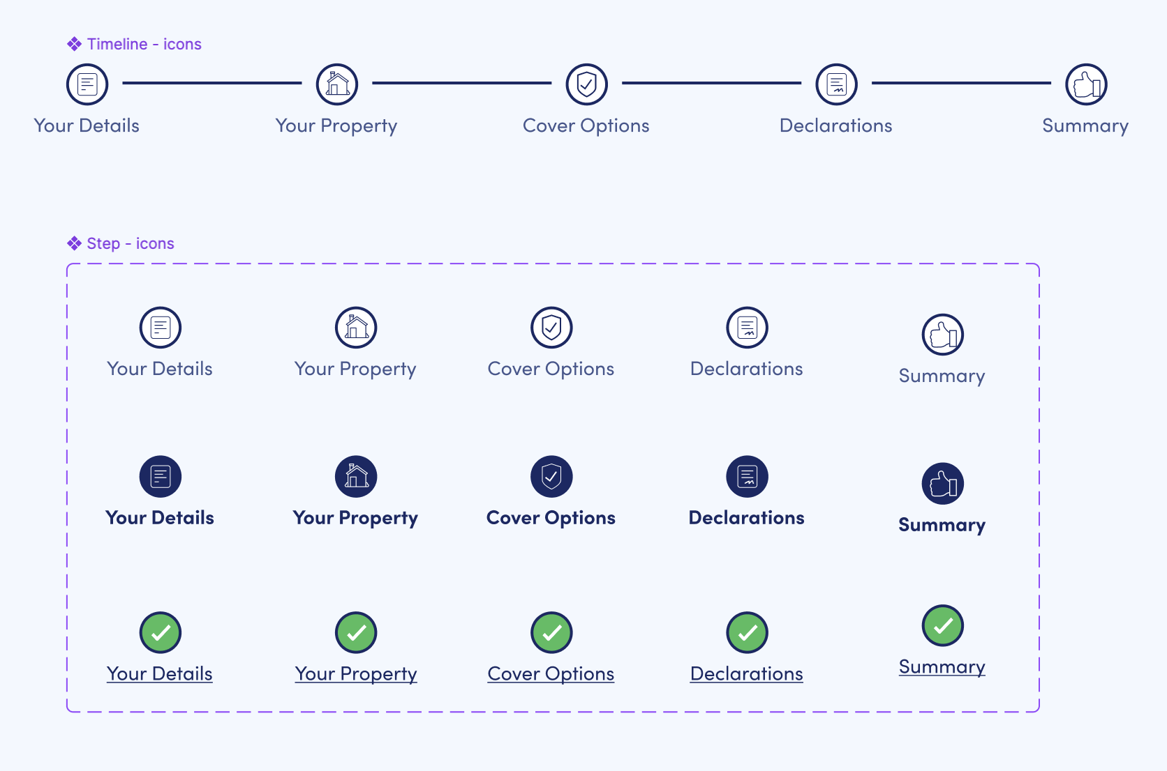
- Progress tracking
Each component included full state definitions for desktop and mobile, including:
- Validation and error states
- Tooltips and helper text
- Hover and focus states
The resulting component library allowed us to standardise form behaviour across the journey and accelerate future development.
Prototyping Complex Logic
To validate the experience, I built a fully interactive prototype simulating the journey’s branching logic.
Boolean variables were used to control question visibility, allowing stakeholders to experience how different answers triggered different question paths.
This prototype helped the team:
- Understand the real cognitive load of the journey
- Identify areas where wording or structure needed improvement
- Provide insurers with context to review question changes
It also enabled early design improvements such as introducing a progress tracker to help customers understand their position in the journey.
User Testing
The prototype allowed us to run early usability testing focused on:
- Clarity of insurance terminology
- Ease of answering risk questions
- Perceived effort of completing the journey
We also evaluated specific design elements such as the progress tracker, exploring whether it reassured users by showing progress or increased anxiety by highlighting journey length.
Potential enhancements explored included time estimates to better set expectations.
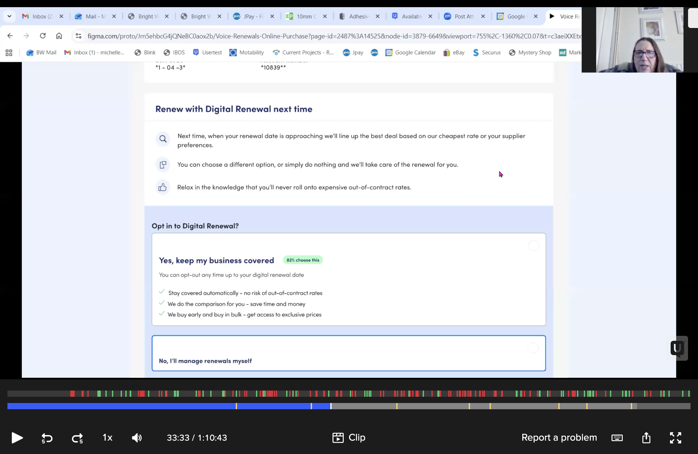
Experimentation & Optimisation
Once launched, the new journey enables A/B testing and behavioural analysis that were previously impossible.
This allows the team to experiment with:
- Question wording
- Journey length and grouping
- Progress indicators
- Information hierarchy
The goal is to continuously optimise completion rates and reduce friction across the insurance purchase journey.