British Gas Booking
The Challenge
At British Gas I worked within the Online Account Team as part of a broader digital transformation initiative. The site contained substantial service complexity, with dozens of online account journeys and a clear opportunity to simplify the experience.
My focus was the set of journeys related to booking an engineer. I needed to redesign these flows to align with updated style guides while also improving conversion and reducing calls to service centres.
Data Analytics & Experience Mapping
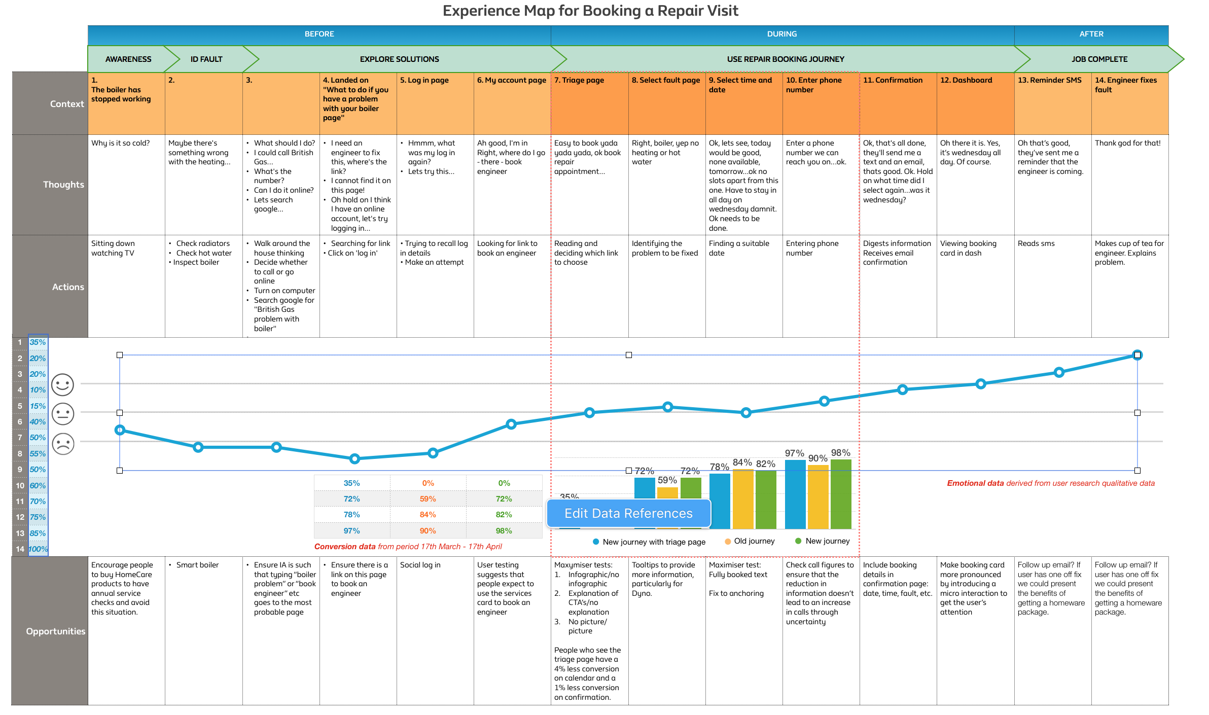
I used Adobe Analytics to examine conversion performance and fallout paths across the engineer booking journey. This showed where customers were dropping out, but not why.
To understand the causes behind that behaviour, I reviewed hours of Clicktale session recordings and paired that evidence with prior user testing. I then created an experience map to visualise the journey end to end, combining qualitative insight with quantitative data so the team could see both the emotional and commercial impact of each step.
Two issues became clear. First, many customers still preferred to call British Gas when something had gone wrong at home, especially when the issue felt urgent. Second, around 40% of customers using the web journey were dropping out.
Humanising the Journey
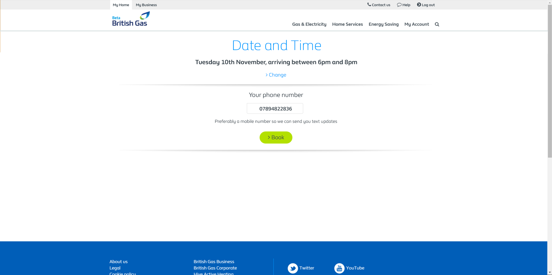
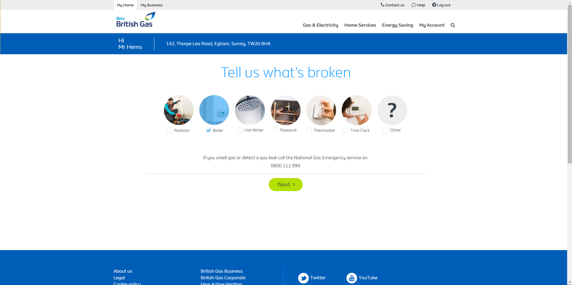
The existing journey presented too much information at once, increasing cognitive load at a moment when customers were already stressed. I simplified the flow by removing unnecessary content and restructuring the experience as a progressive disclosure.
I also rewrote the journey so it felt more like a human conversation. Labels such as “select fault” became more natural prompts such as “tell us what’s wrong”. Combined with smaller, more focused steps, this made the experience feel more reassuring and more like an interaction with a helpful person than a rigid system.
To improve confidence further, I added a free-text field so users could describe the issue in their own words, and reviewed the visual language used for fault selection to ensure the options were recognisable and easy to understand.
Optimising Conversion
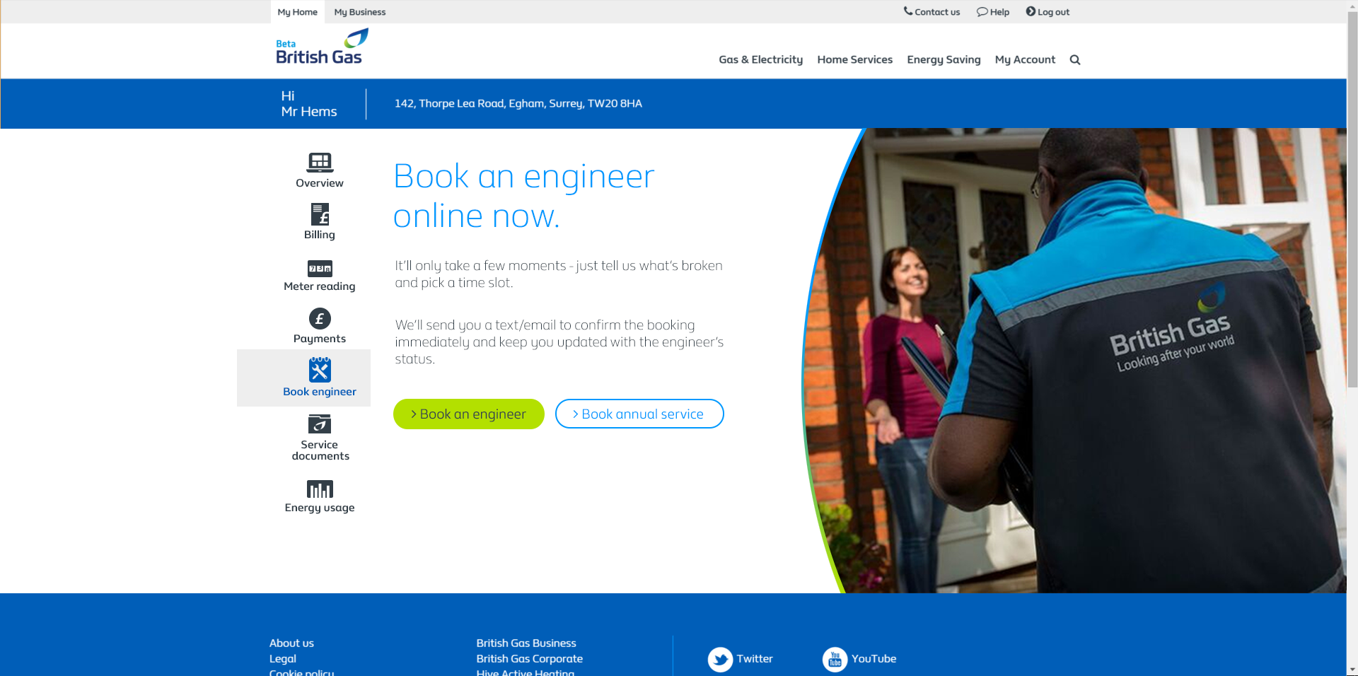
The data suggested that some customers entering the engineer booking area were actually looking for an annual service visit rather than a breakdown appointment. Because annual service options were only exposed under specific conditions, these customers often failed to find what they needed and dropped out.
To isolate this problem, I introduced a new triage page separating annual service visits from standard engineer bookings. This allowed the team to measure the standard booking journey more accurately and reduced confusion for customers who had different goals.
User Testing with Axure Prototypes
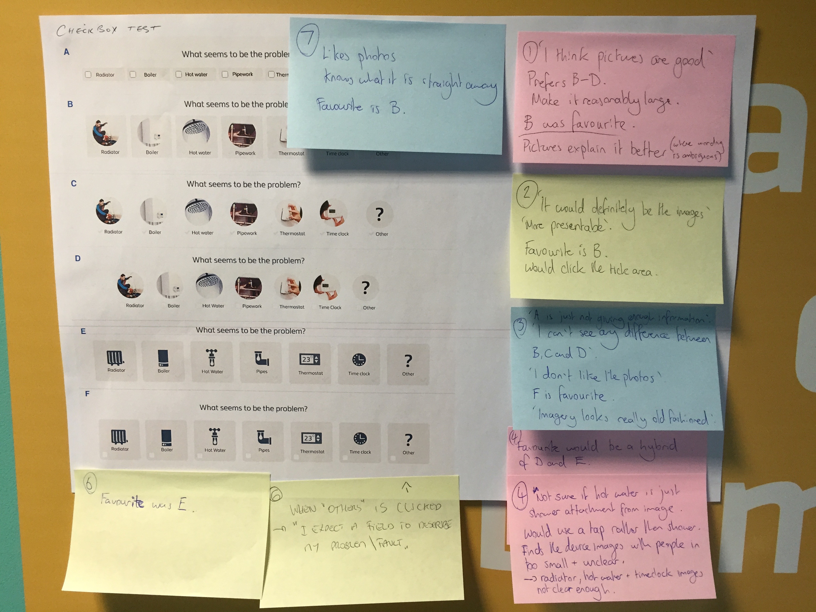
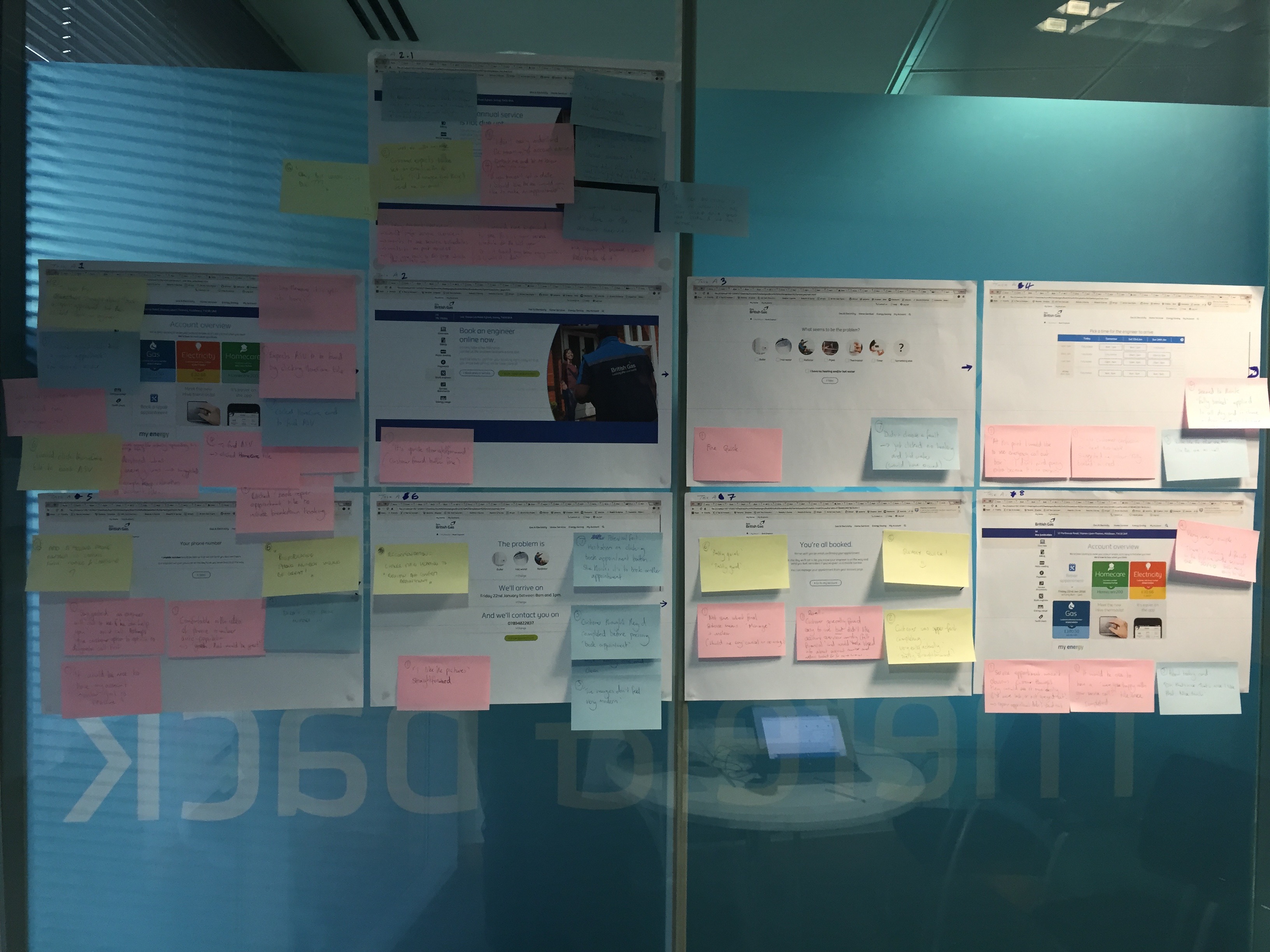
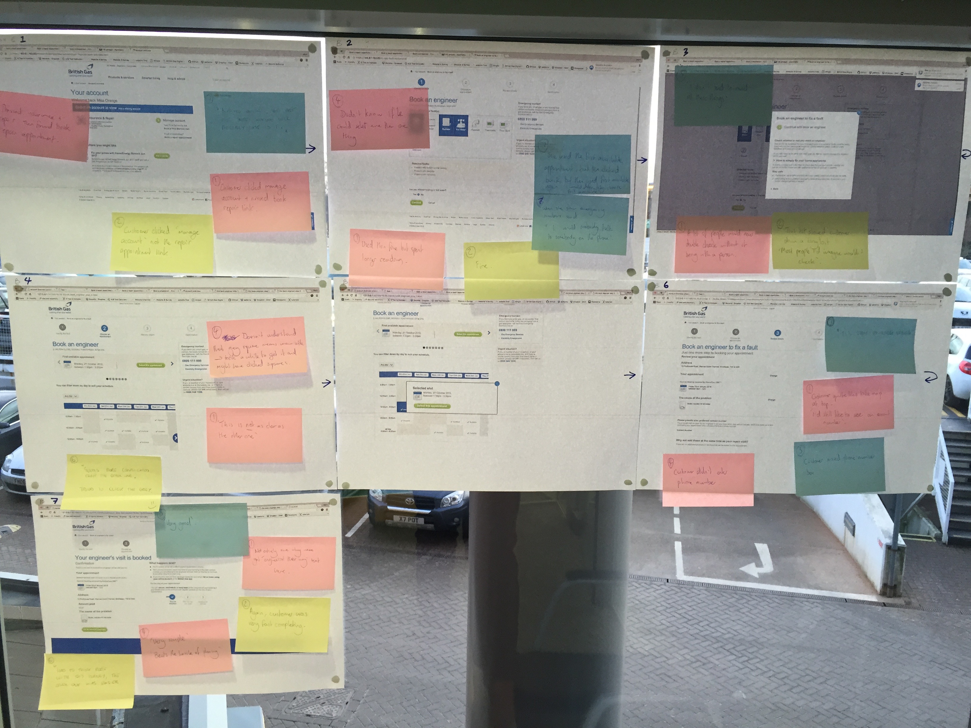
With a set of hypotheses in place, I built an Axure prototype and designed a structured test script to evaluate the new journey with users.
The prototype was tested directly against the live production journey. To make analysis quick and collaborative, each page from both journeys was printed and displayed on the wall so feedback could be captured immediately with notes and compared screen by screen.
Results
Following testing, participants completed a System Usability Scale comparison. The new journey scored 88.3%, compared with 78.3% for the production version.
When asked which experience they preferred, 80% chose the new design. The redesigned journey was also faster, taking an average of 2.41 minutes to complete versus 3.20 minutes for the production journey.
These findings supported the core hypothesis that a simpler, more human and more reassuring experience could increase web completion and reduce dependency on contact centres.
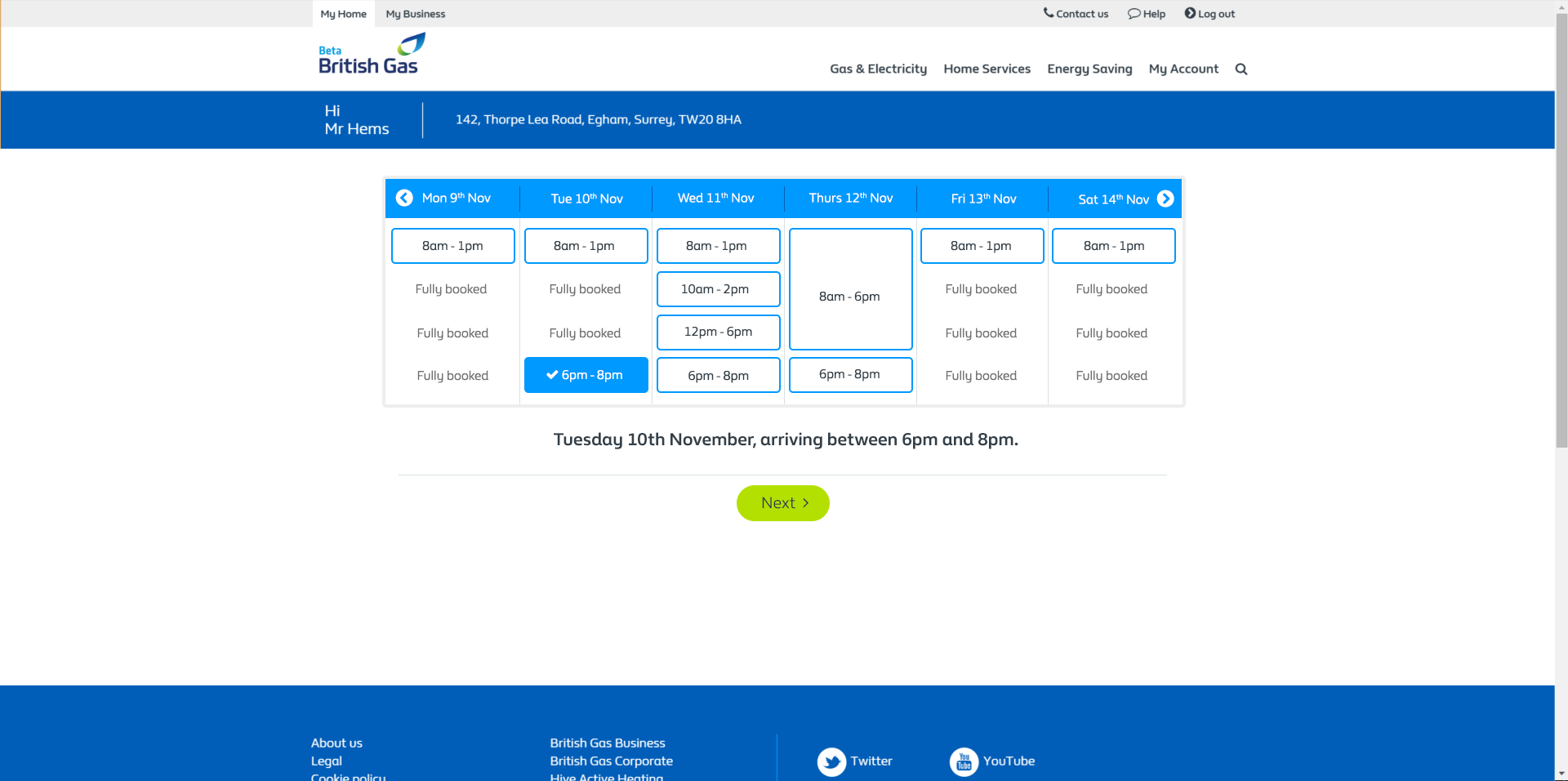
Visual Design
Using the research findings, the flow was iterated further and translated into high-fidelity visual designs that acted as pixel-accurate implementation guides for developers.
The updated screens aligned with British Gas style guidance while preserving the core UX improvements developed through analytics, mapping and testing.
Conversion Optimisation
After implementation, the new journey was monitored using analytics and Clicktale recordings. Features were introduced incrementally and A/B tested on the beta site.
Before the new triage page was even added, the changes focused on simplification and humanisation had already delivered a 21% uplift in conversion. The new journey was also significantly quicker in live use, averaging 3.04 minutes compared with 7.43 minutes for the old site.
The improvement in ease of use, reassurance and efficiency was expected to encourage more customers to complete the journey online rather than calling the contact centre, helping reduce operational cost at scale.